
A thorough and detailed research process was carried out to understand user needs and analyse competitors. I found that existing delivery platforms often lack comprehensive support for users with food allergies. This insight guided the development of app features that effectively address these issues and help make users' daily lives more convenient. The coral orange colour used in the brand identity was chosen for its ability to stimulate appetite, aligning with the app’s purpose and tone.
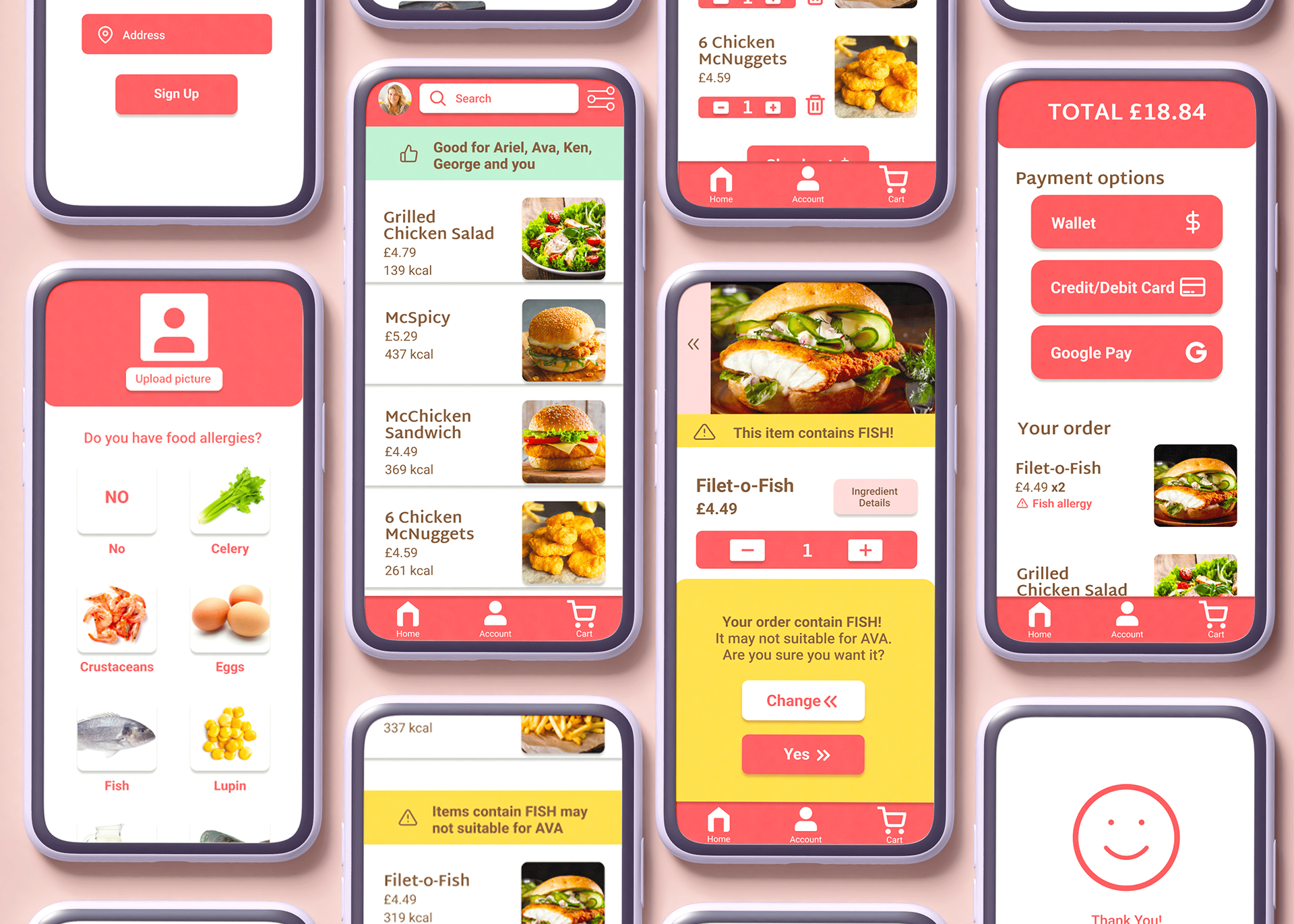
Mock up of screens in the app.
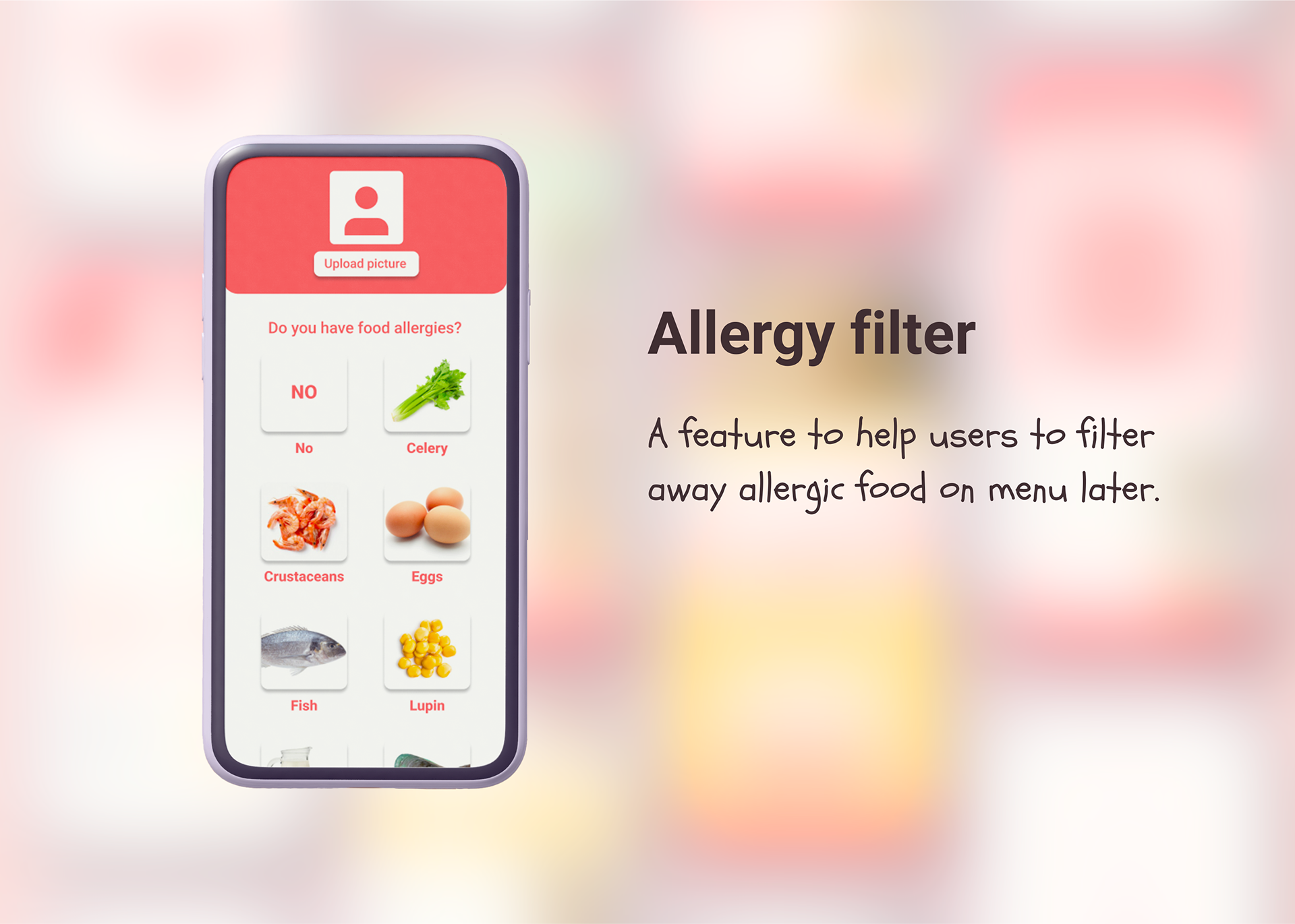
Main feature 1: Allergy filter.
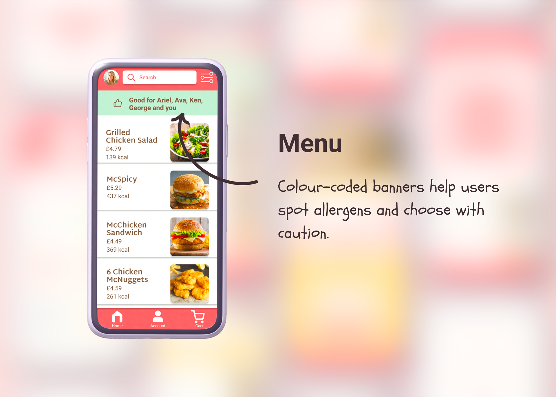
Main feature 2: Menu with colour-coded indicators.
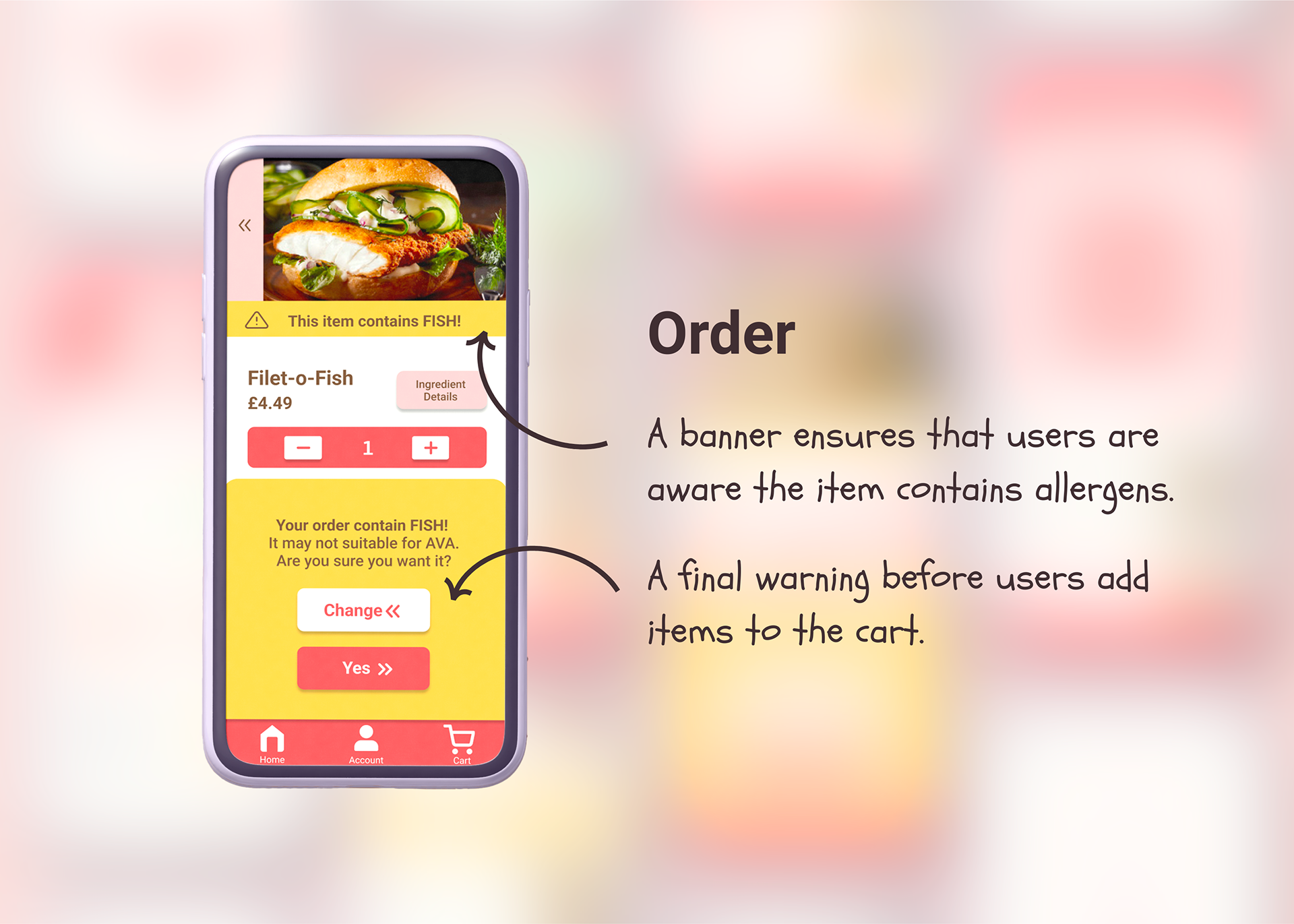
Main feature 3: Multiple warnings are displayed on the order screen.
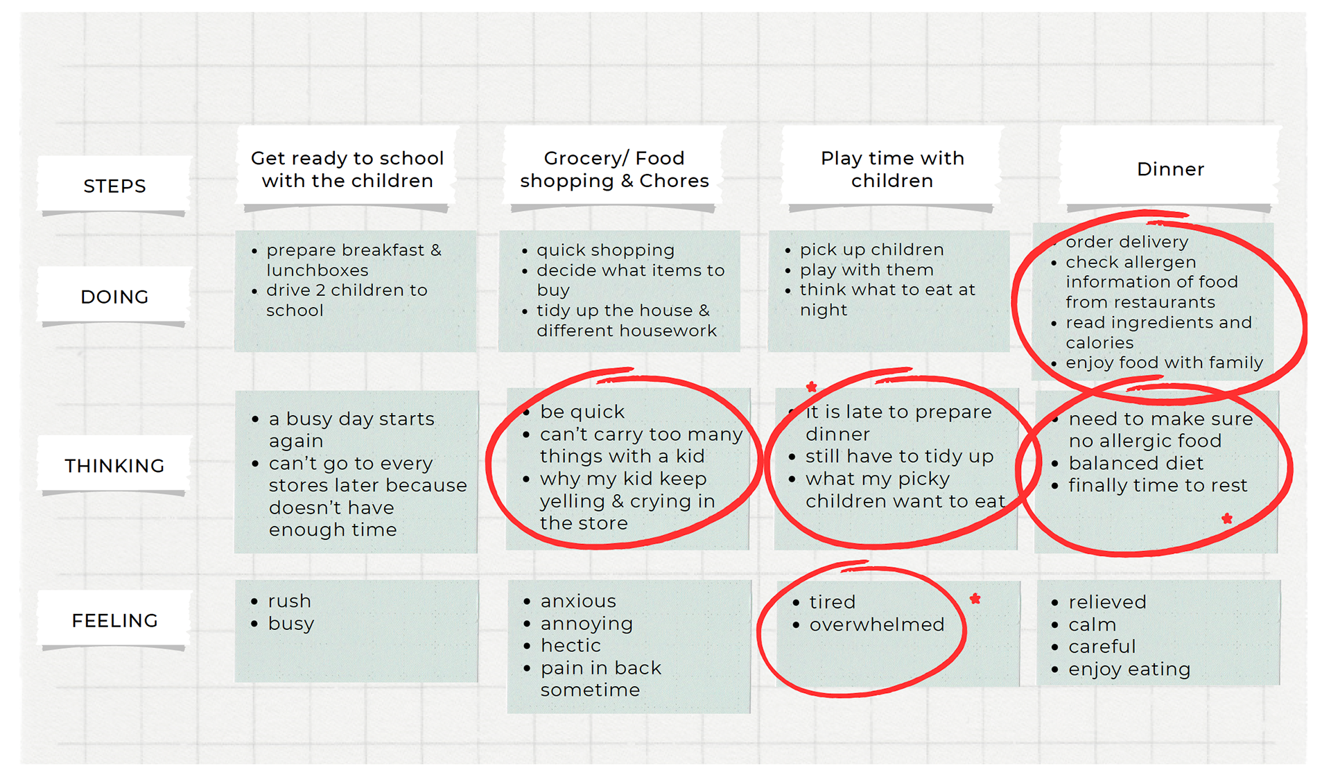
User journey as part of the research stage.
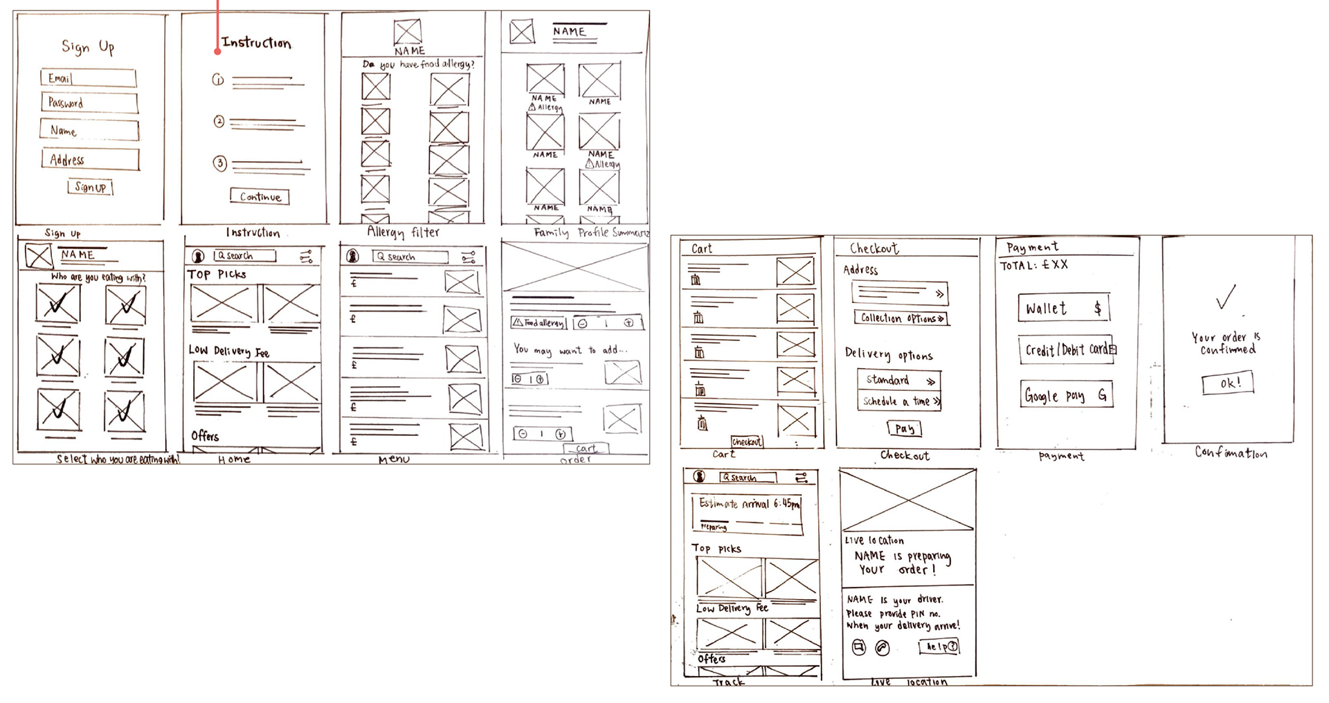
One of the golden path flows that was experimented.
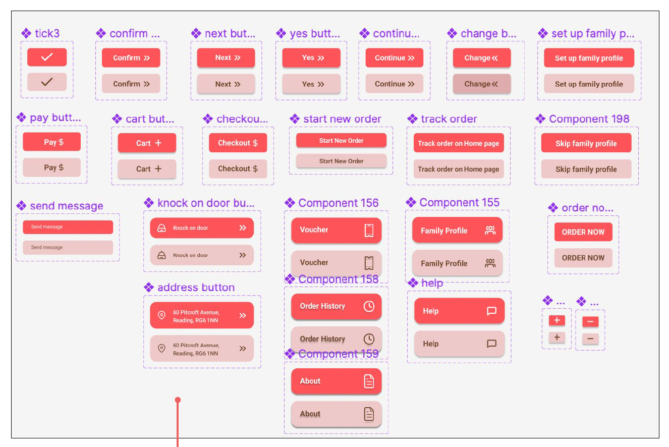
Primary buttons.
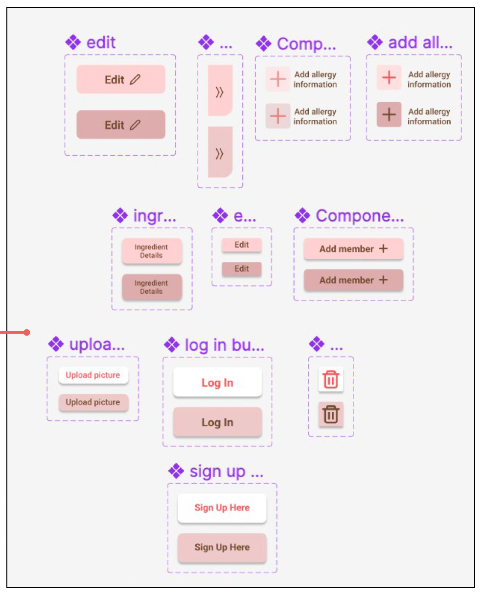
Secondary buttons.