Thanks to our supportive client, I was able to suggest scanning her original artwork to use in the design which I really liked. This added a much more lively and personal touch to the final outcome. Throughout the project, my team explored many logo styles and combinations. After communication and presenting our ideas, we agreed that a wordmark would best represent her brand identity, aligning with her preference to use her full name as the brand name.
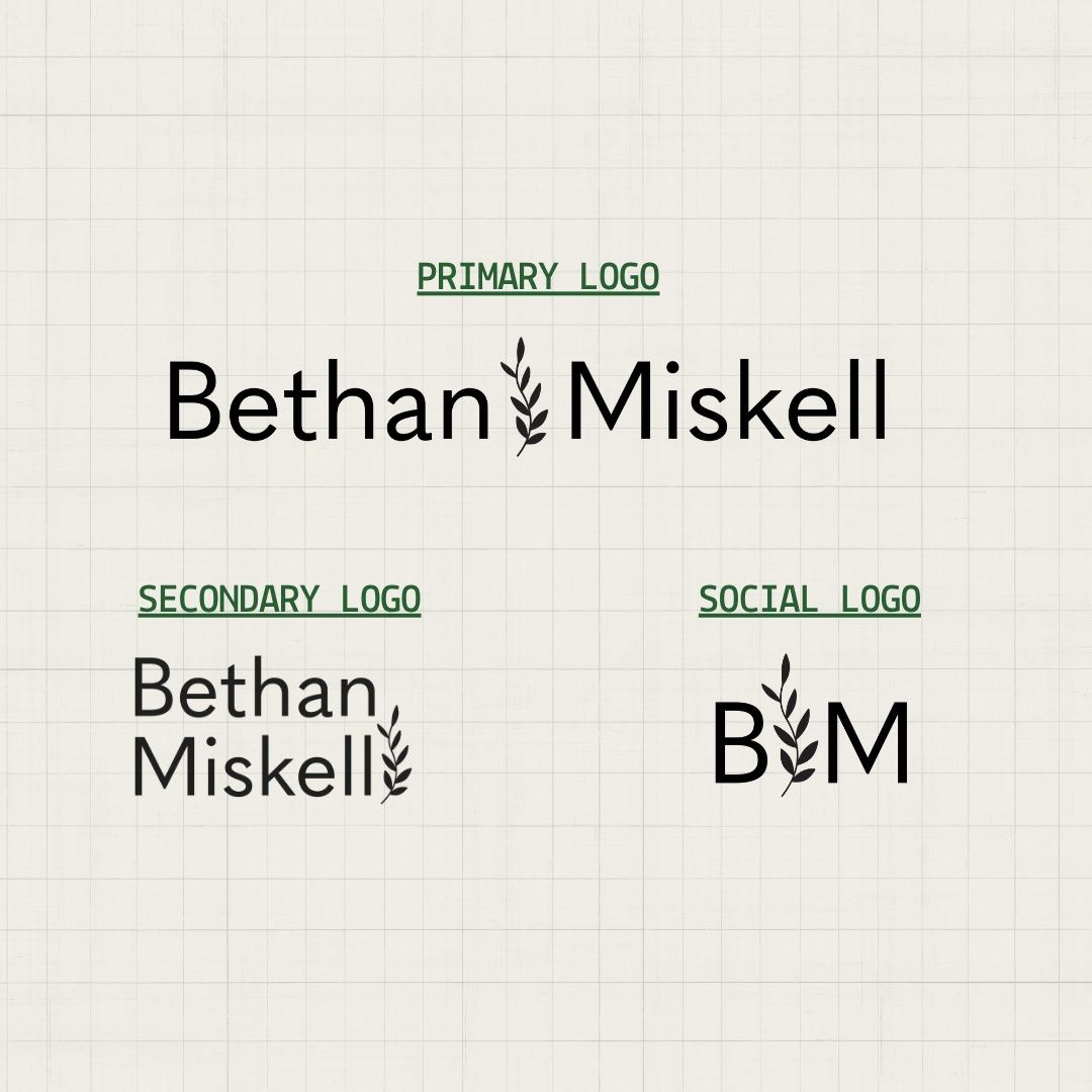
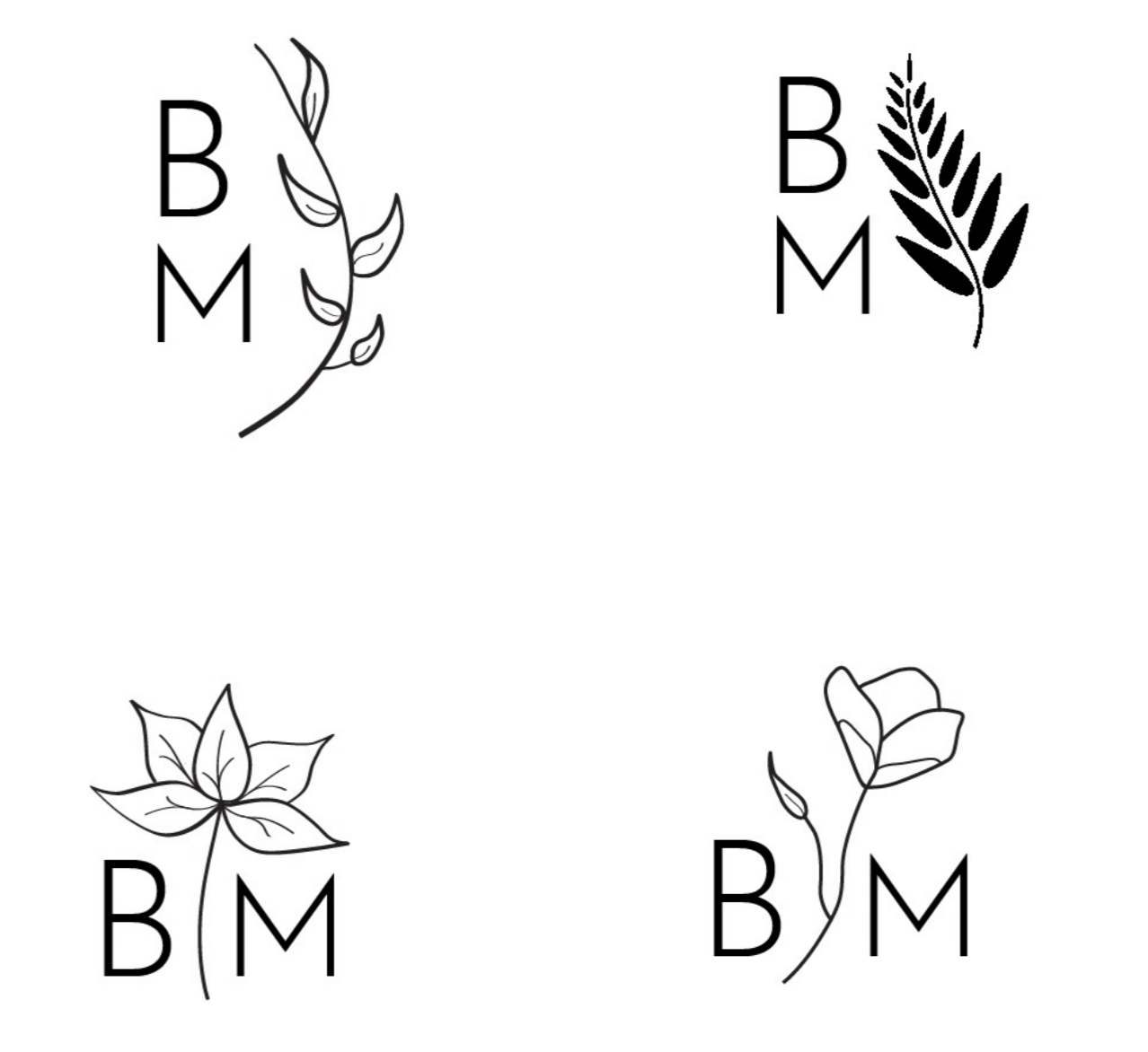
A set of logos was designed in three formats to ensure compatibility across all platforms.
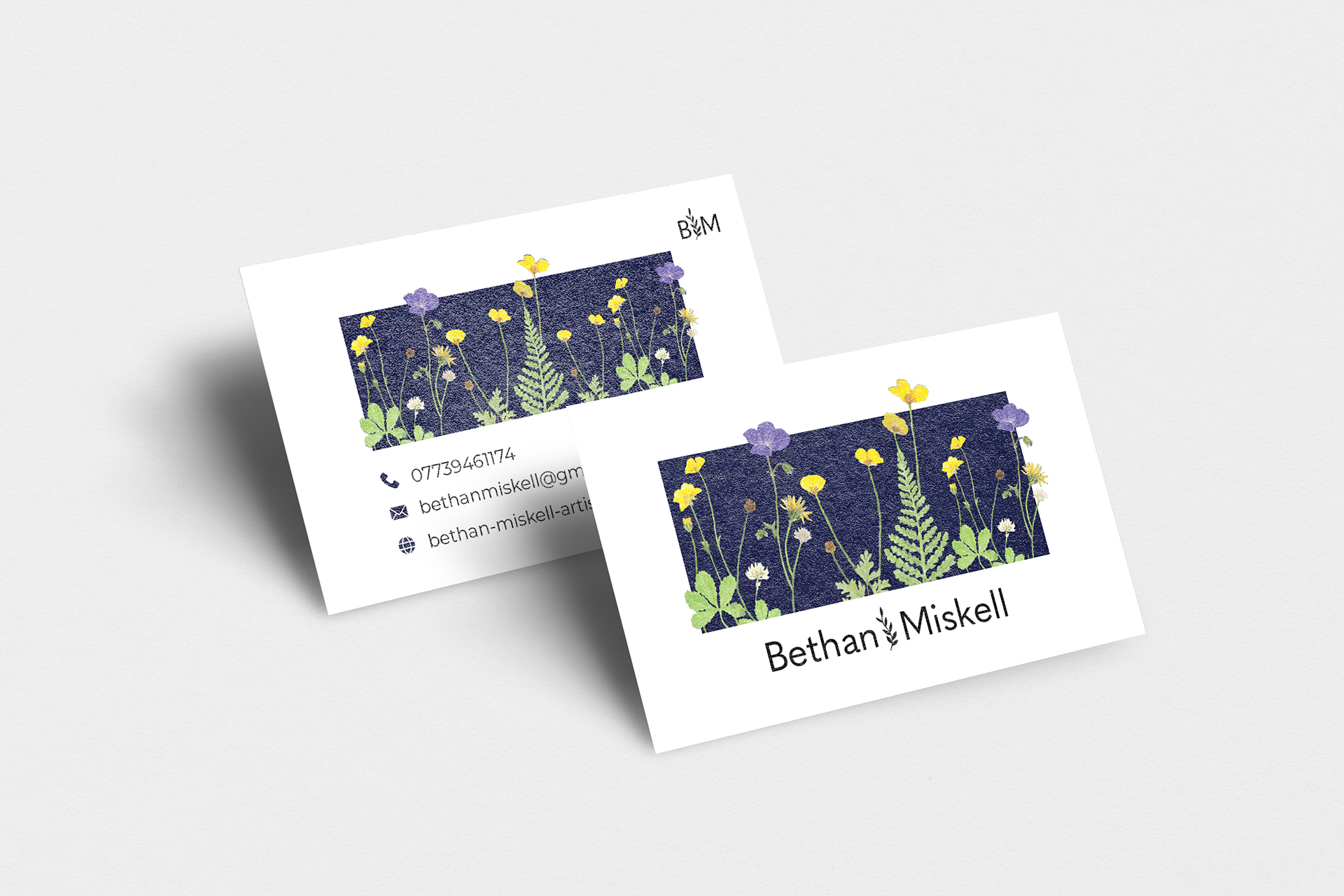
The business card.
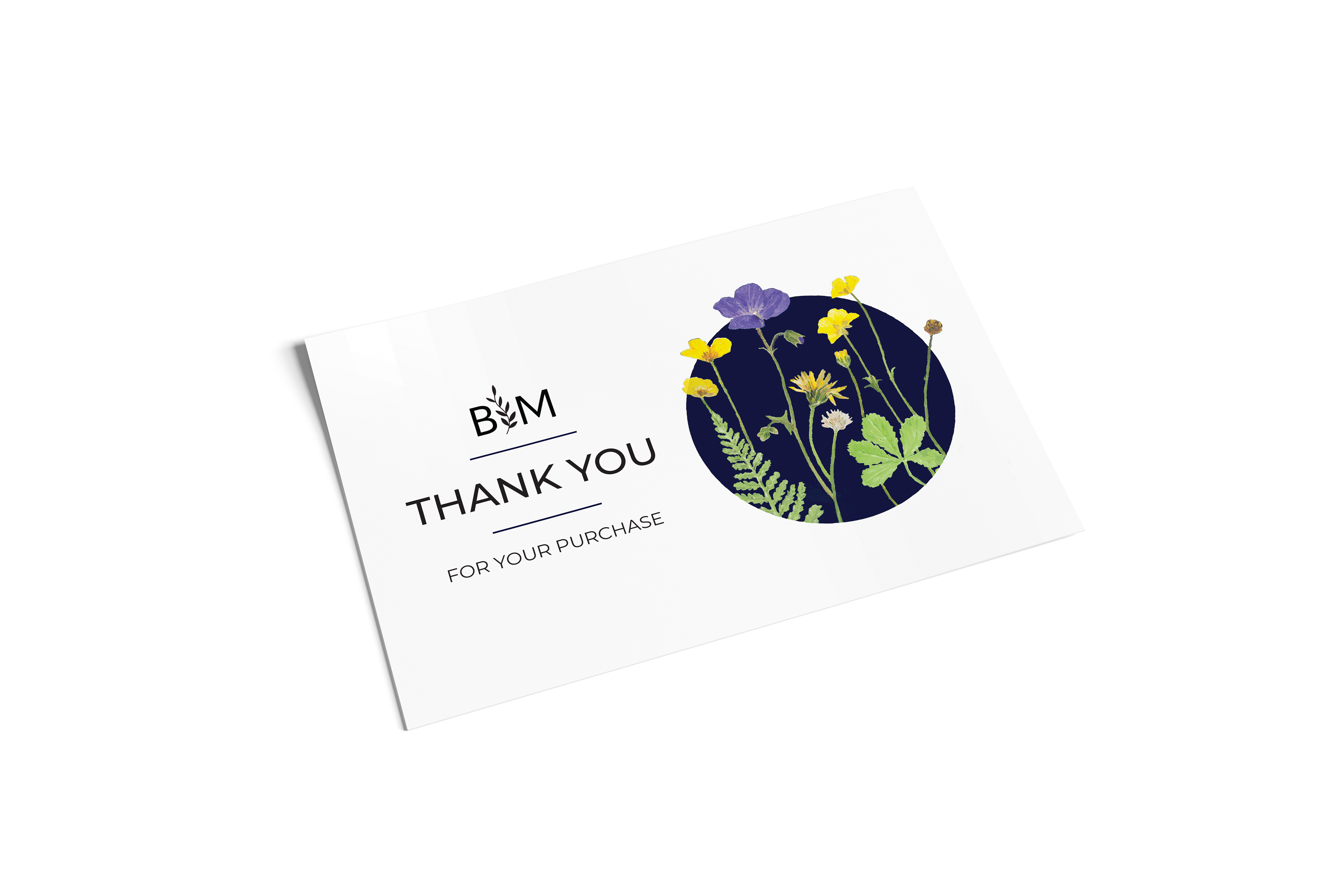
The thank-you card.
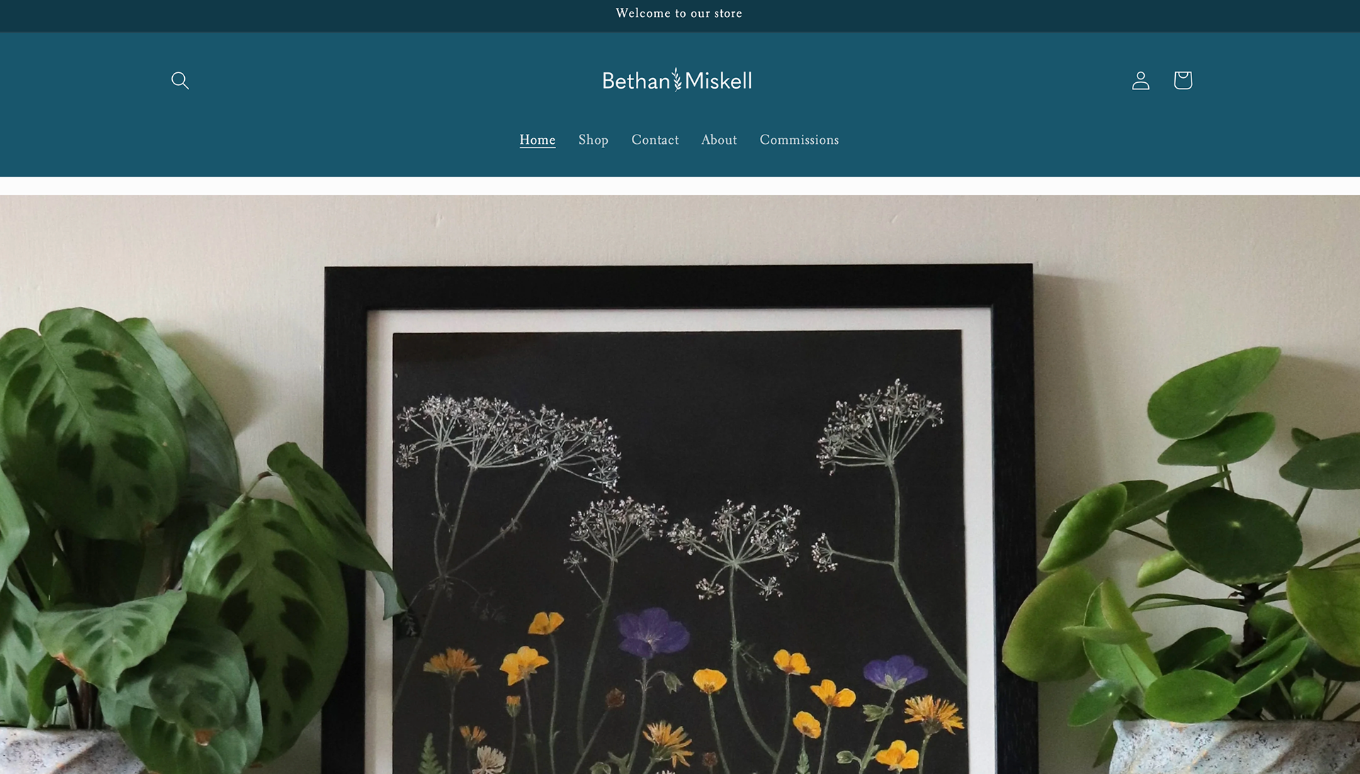
The primary logo is used on Bethan's website.
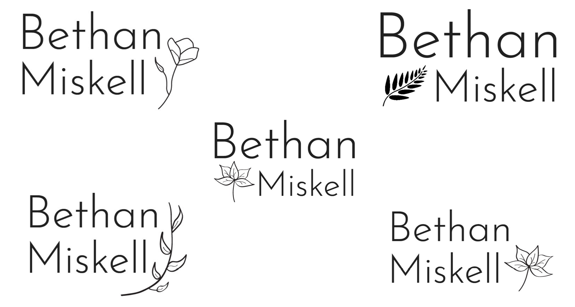
A range of logos were experimented.
Check out my blog post for a deeper look into the design process behind this project.